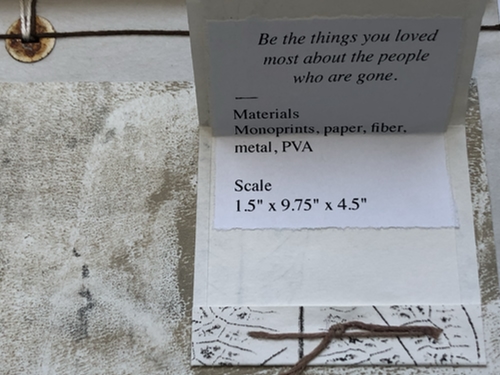
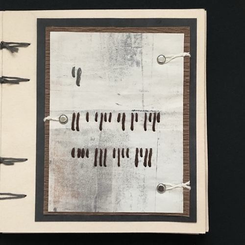
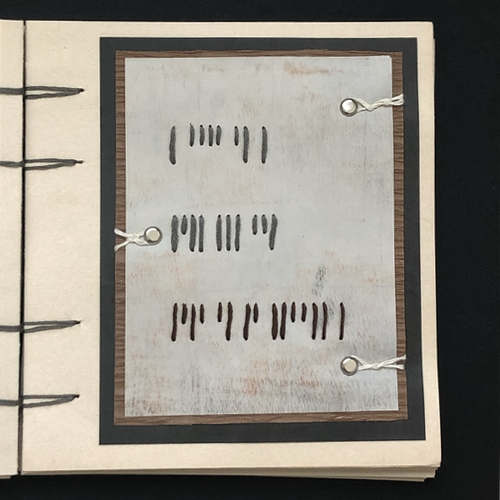
Quote–To Plant a Garden is to Believe in Tomorrow
An altered Morse code was used. Yellow for dots, white for dashes, flipped over buttons for spacers.
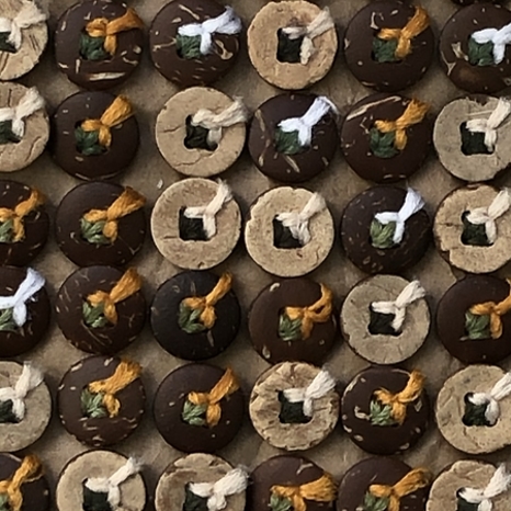
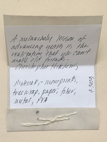
Materials–Paper, fiber, coconut buttons, bamboo, PVA
Scale–8.75″ x 7.75″ x .25″

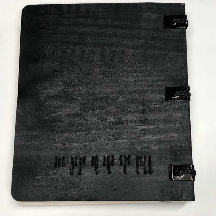
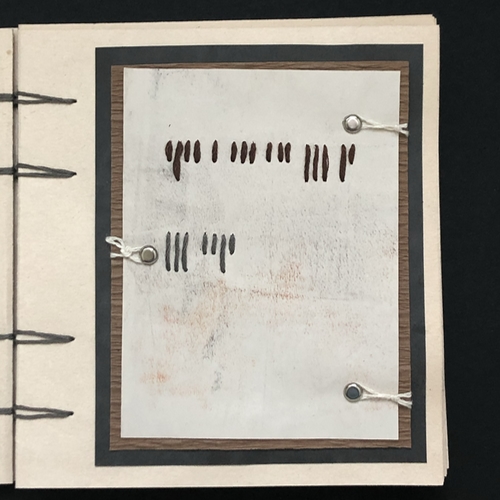
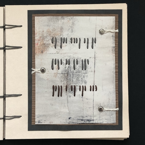
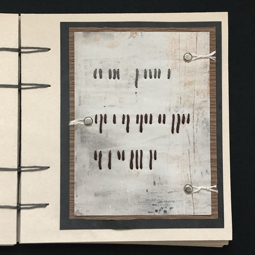
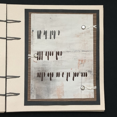
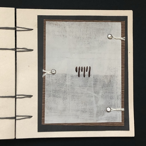
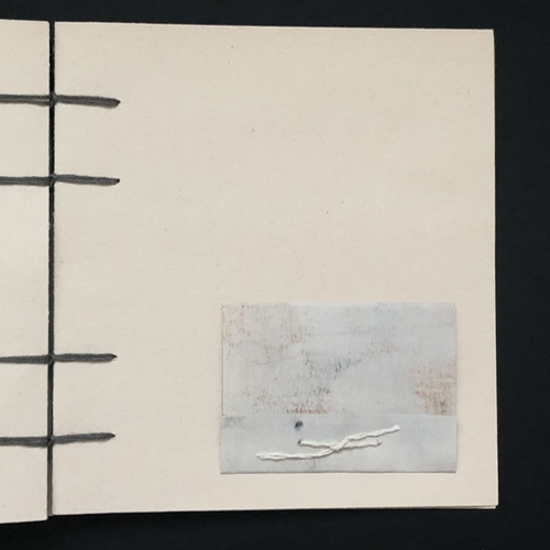
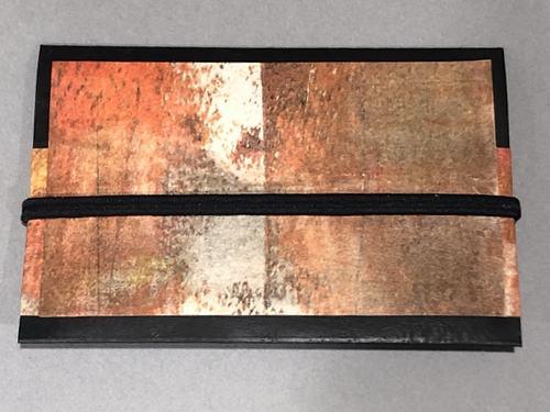
Quote–To Plant a Garden is to Believe in Tomorrow
An altered Morse code was used. Yellow for dots, white for dashes, flipped over buttons for spacers.
Materials–Paper, fiber, coconut buttons, bamboo, PVA
Scale–8.75″ x 7.75″ x .25″
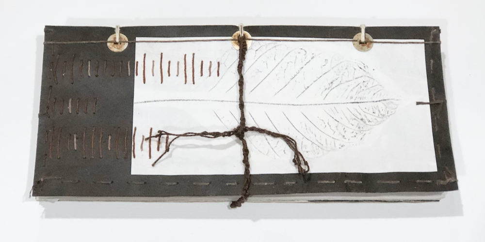
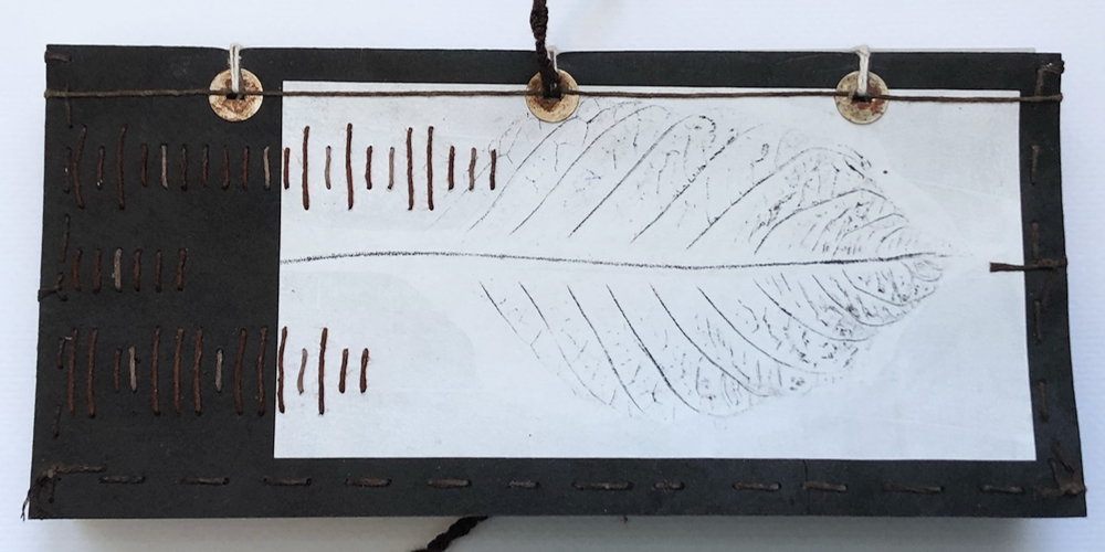
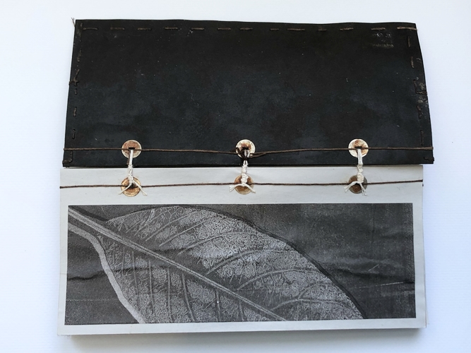
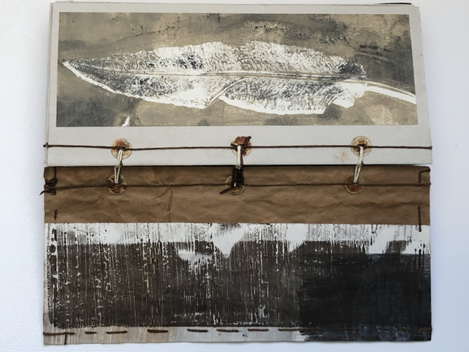
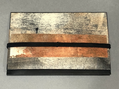
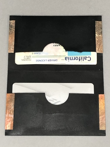
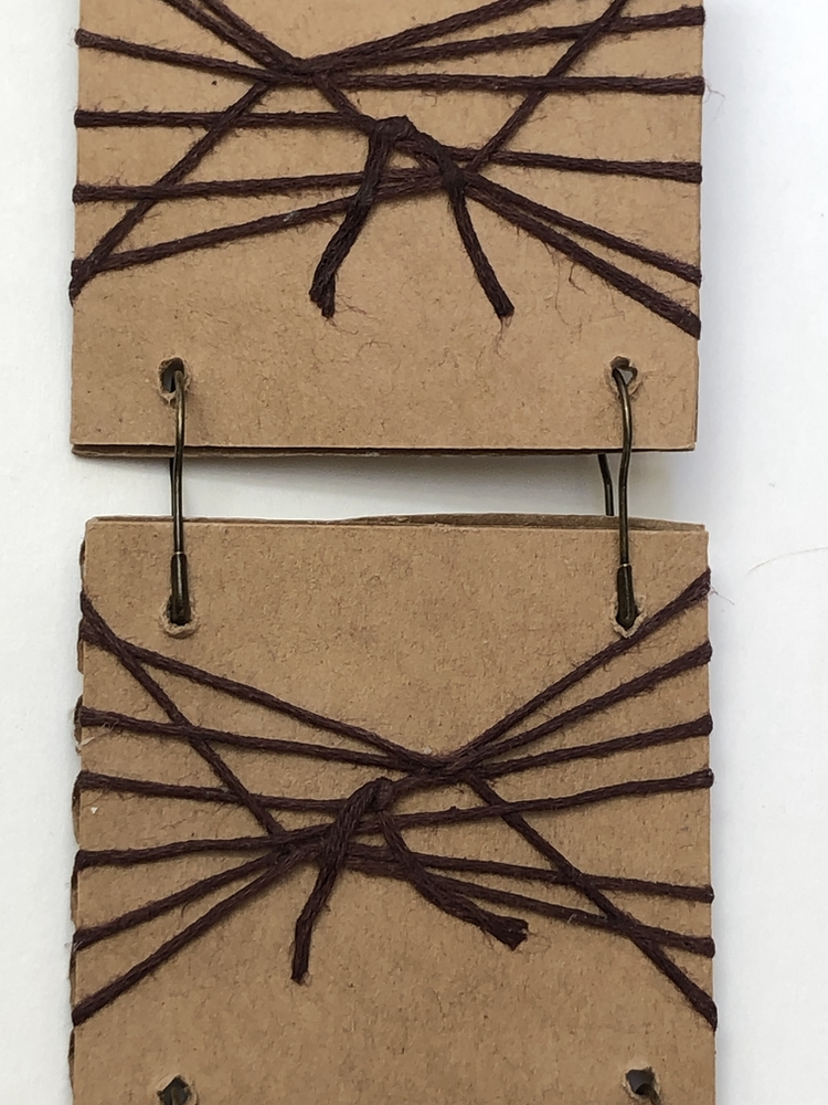
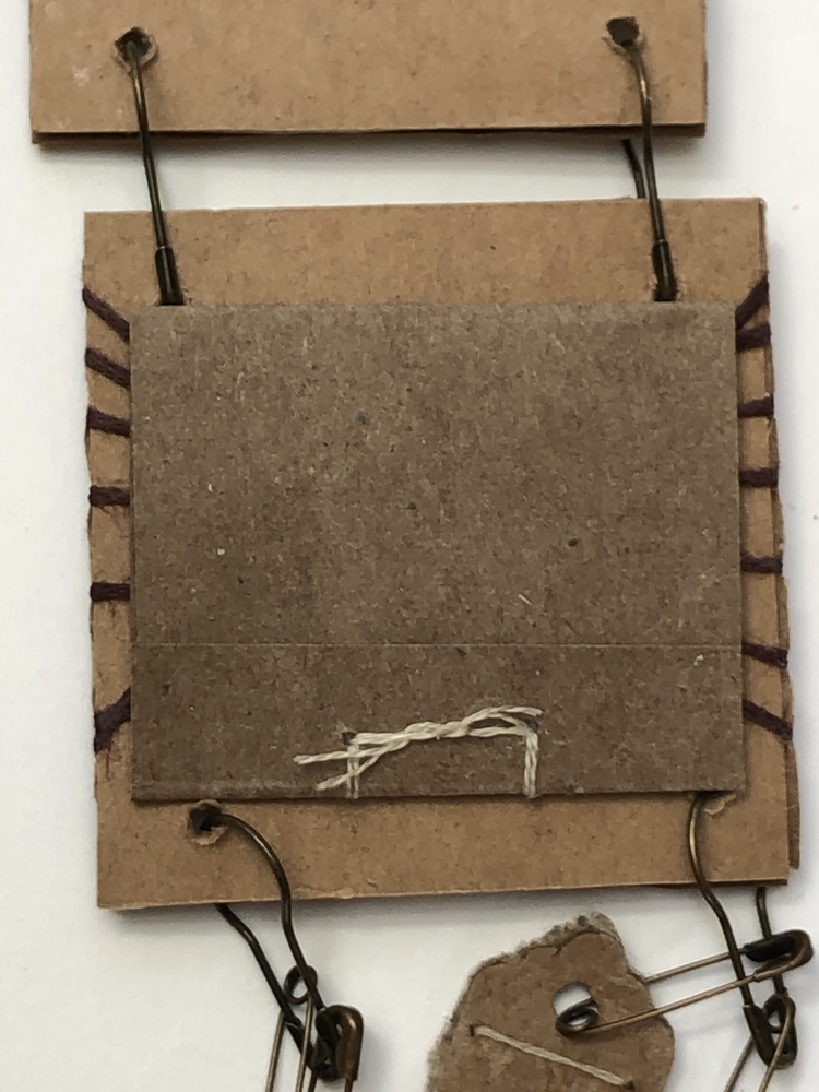
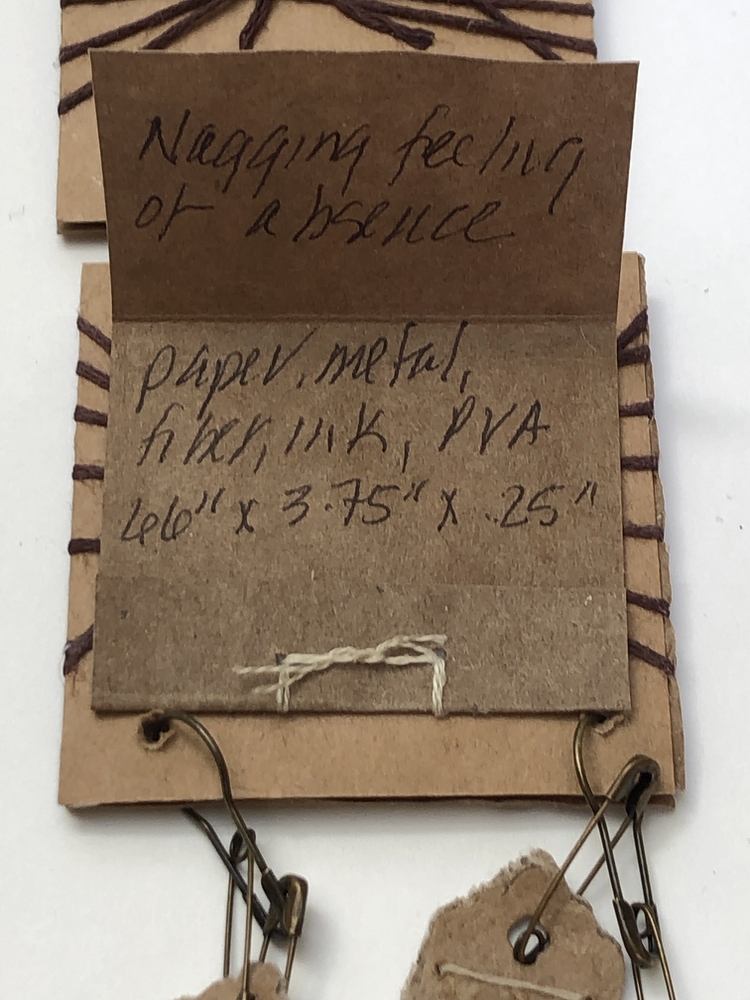
This is a memorial piece for absent family.
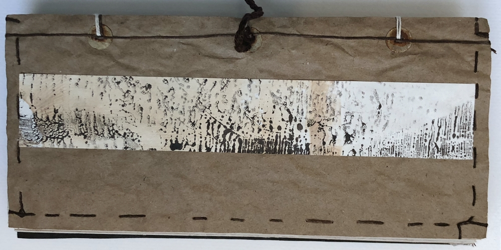
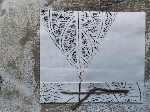
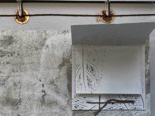
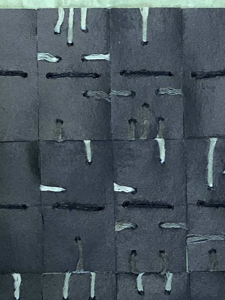
First square is the symbol used for a spacer at the beginning, end, and between words.
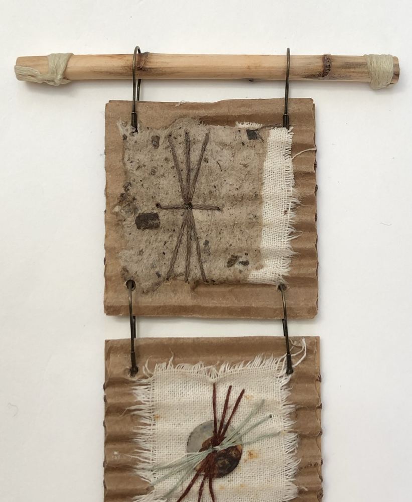
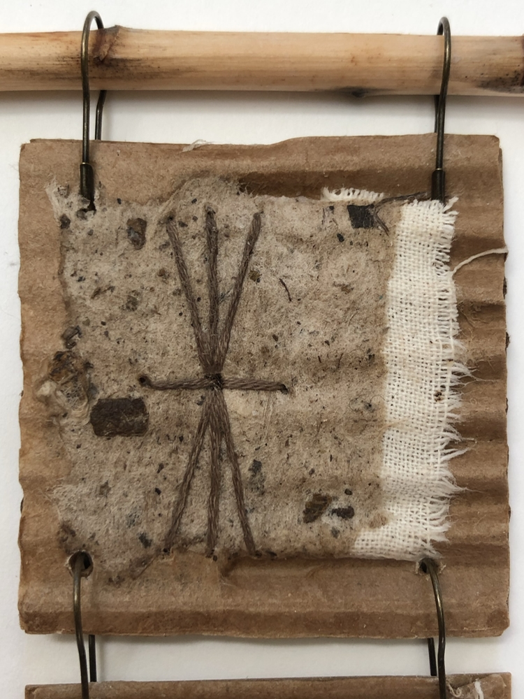
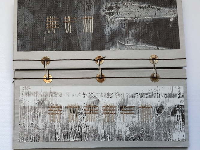
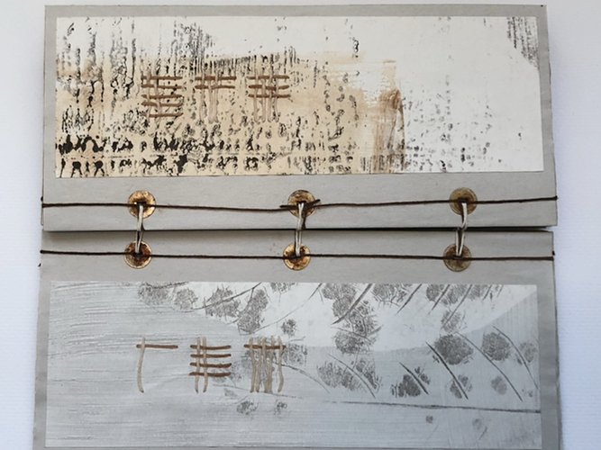
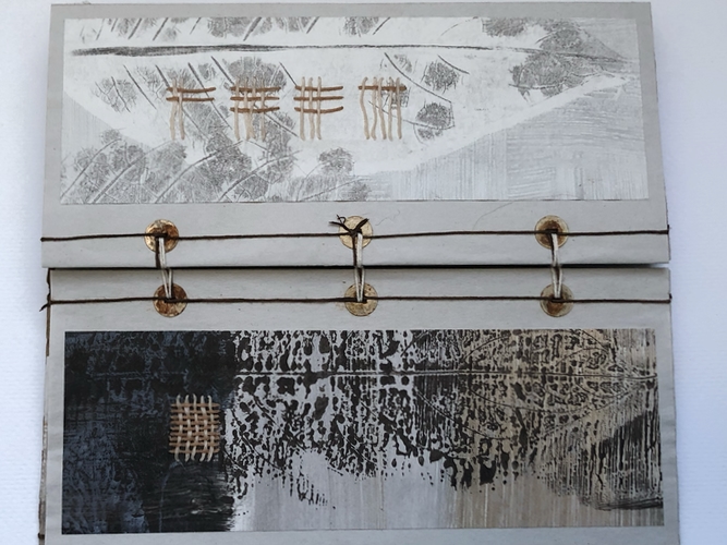
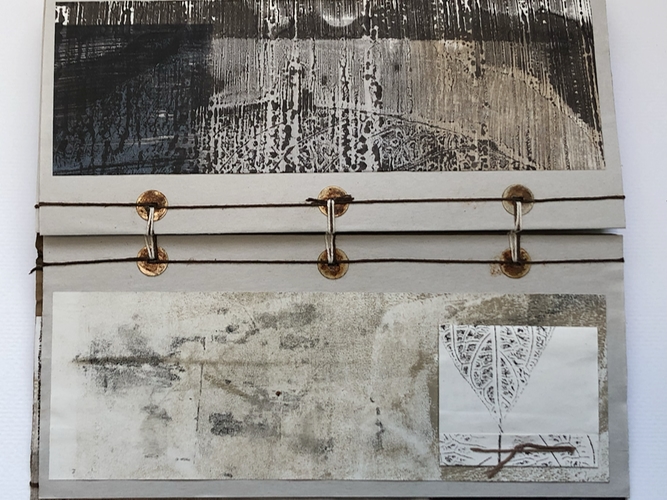
Modified tap and clock code. The rust fiber is the code, the pale green fiber is used for spacers.
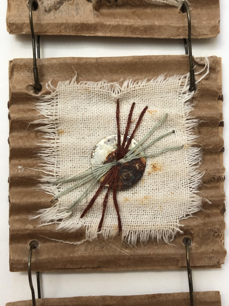
Each cardboard card is reinforced with a piece of cardstock. The cardstock is bound through the cardboard and around the cardstock.
Notes on Work
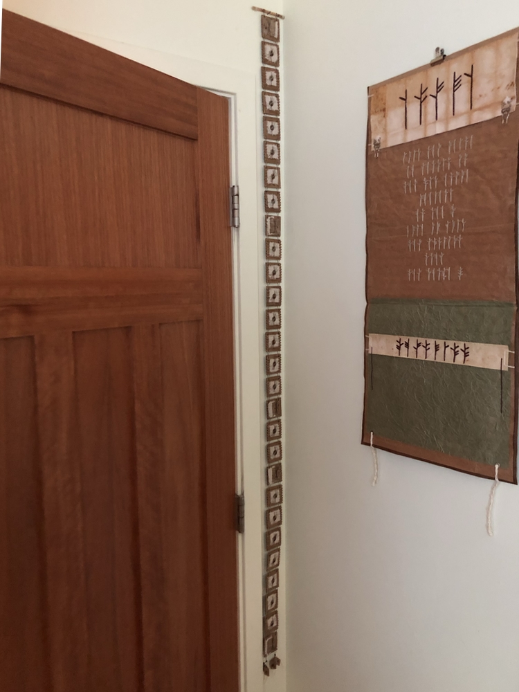
Hung in the corner of the guest bedroom that has become storage space for work.
Materials–Paper, metal, fiber, ink, PVA
Scale–66″ x 3.75″ x .25″
Carl Sagan quote–We wish to find the truth, no matter where it lies. But to find the truth we need imagination and skepticism both. We will not be afraid to speculate, but we will be careful to distinguish
speculation from fact.
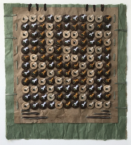
Code is modified tap code in a domino format.
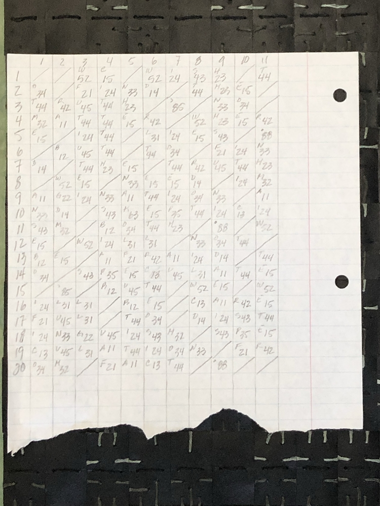
The upper portion in stitched is a lighter green than the bottom portion.
Since C and K are typically the same I decided to give K the code 63 (C is 13), comma 85, and period 88.
Unfortunately, when I photographed the piece with my phone, the dark green fiber is difficult to distinguish from the black domino cards.
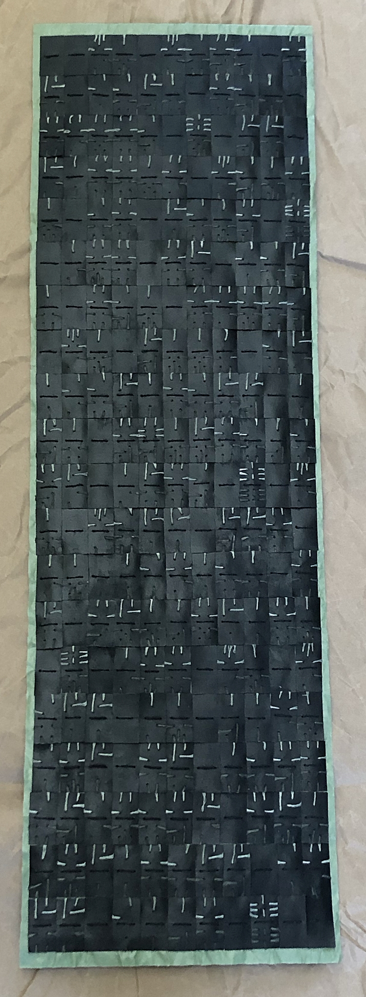
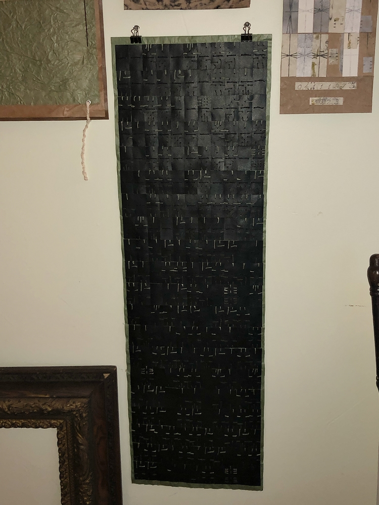
Materials–Paper, Fiber, PVA, Binder Clips
Scale–11” x 35” x 1”
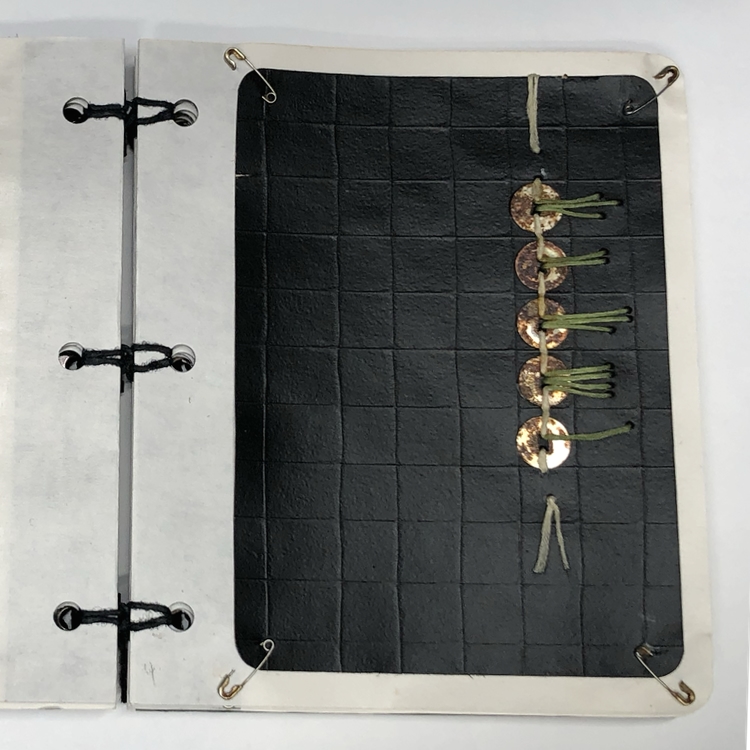
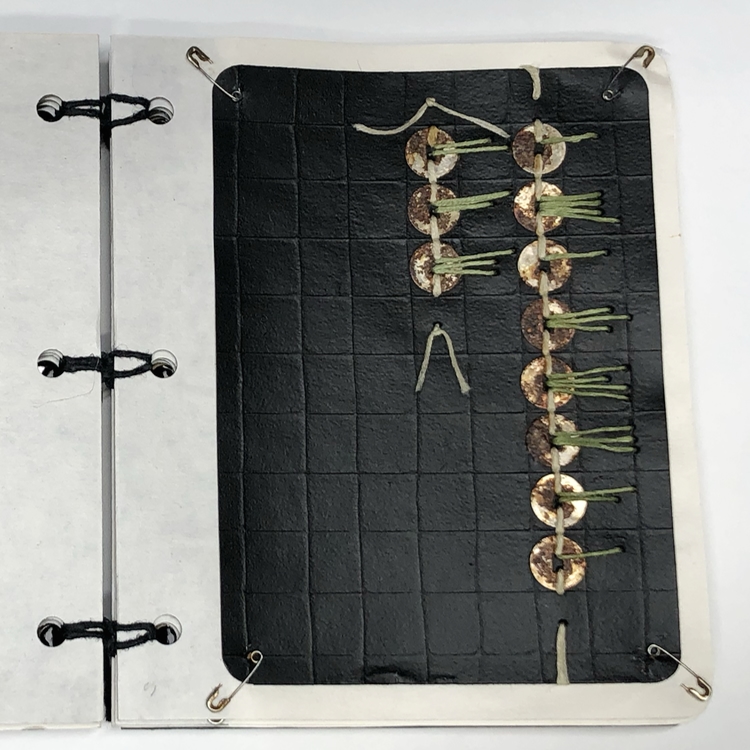
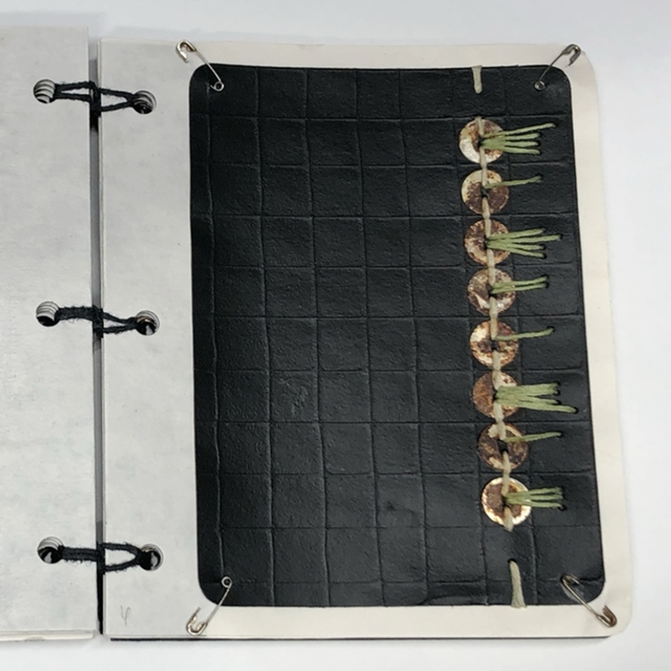
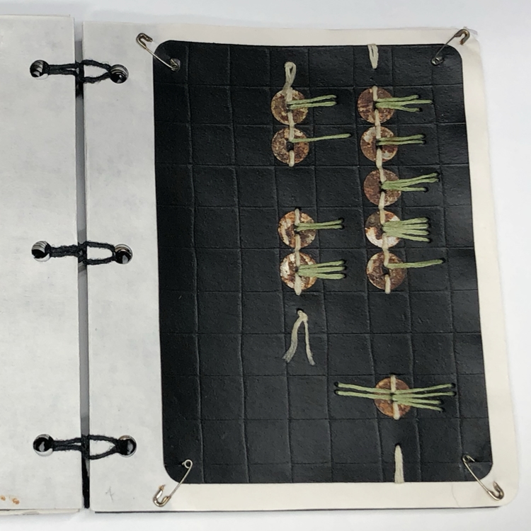
Made a code combining Morse and Clock. Short lines are used for dots and long lines for dashes. The code is–
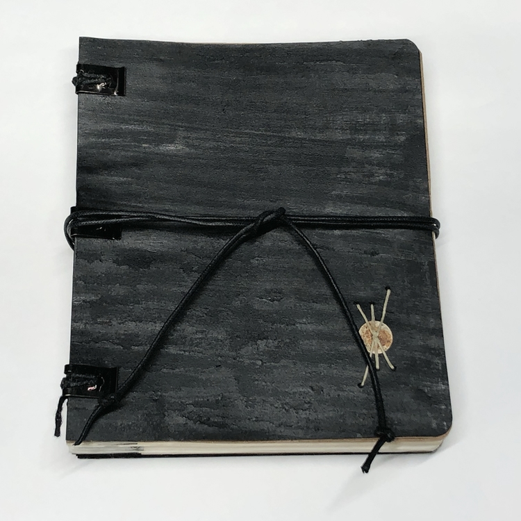
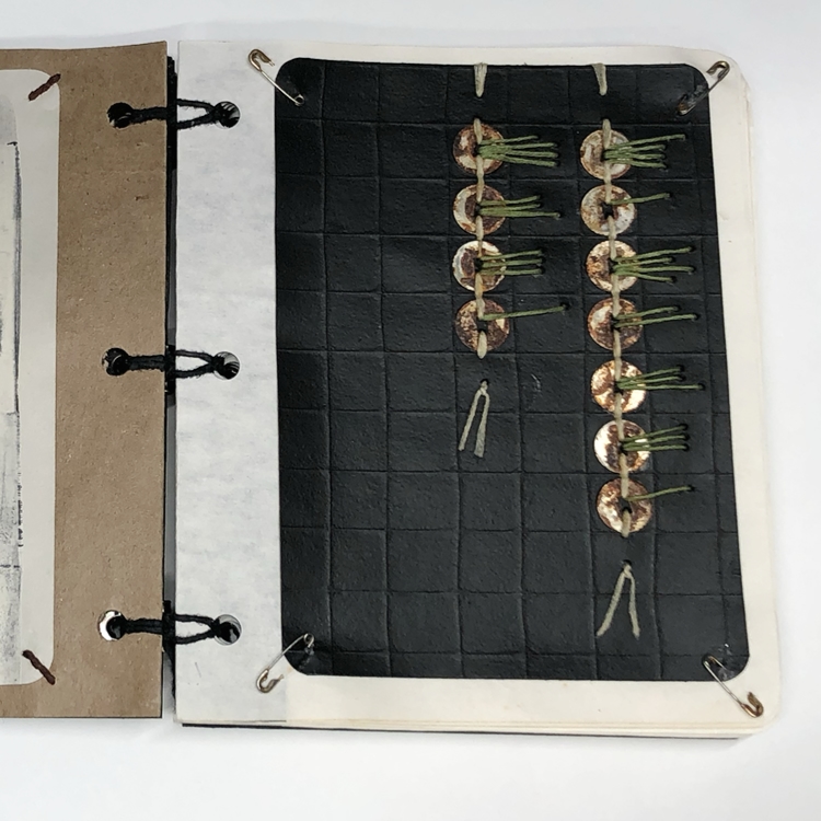
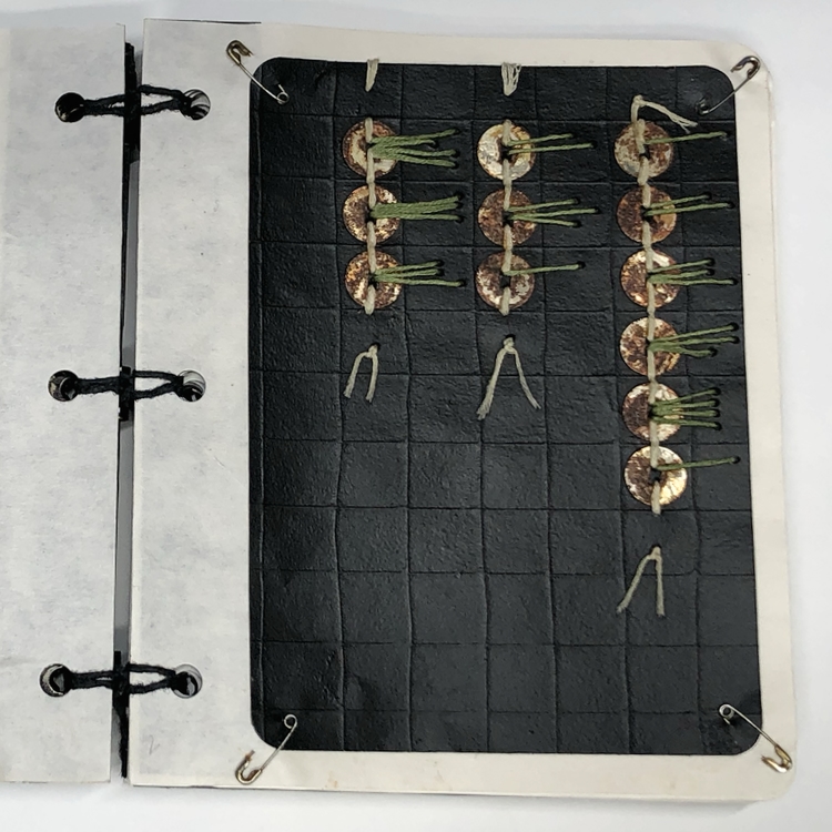
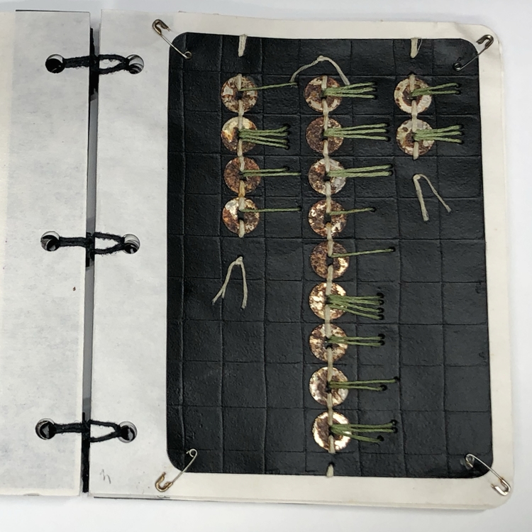
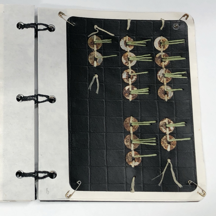
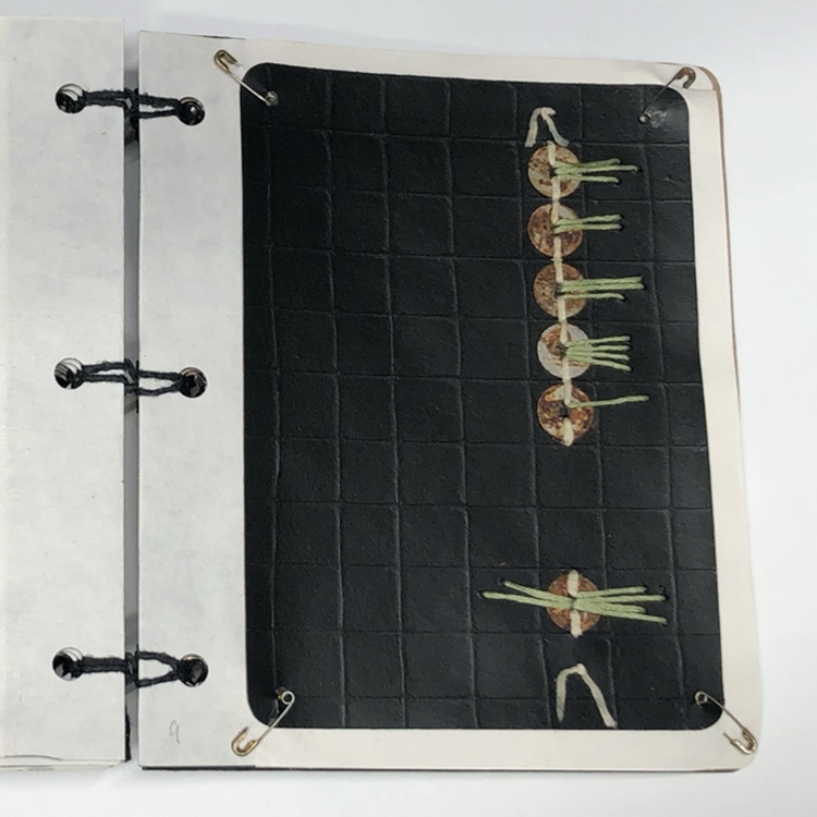
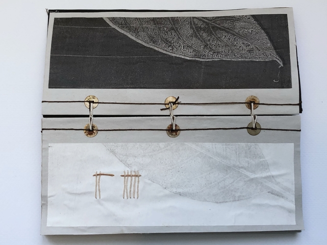
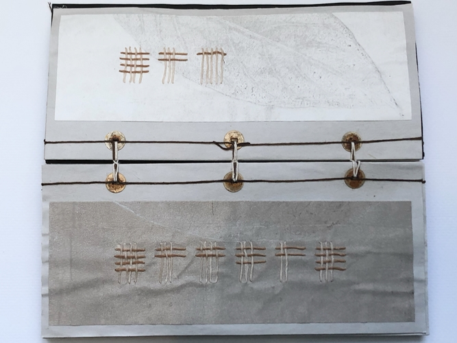
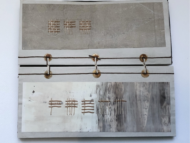
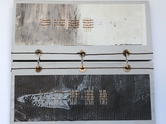
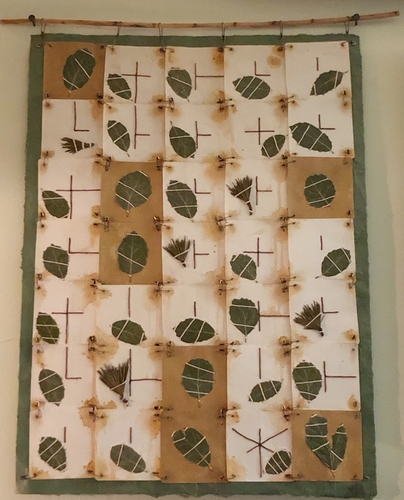
Friendship is a sheltering tree. It is a Samuel Taylor Coleridge quote.
Plant materials are from my gardens. California Live Oaks have sharp and prickly leaves. The needles are from, I think it is the White Pine. They are also a bit prickly.
Materials–Plant material, paper, safety pins, fiber, PVA.
Scale–21.5” x 18.5” x .5”
Every day there are reports of multiple books banned because some people found them offensive. Often those same people haven’t even read them. Simple Solution–if you believe that you won’t like a book; don’t read it. Don’t make books unavailable for people who would find them enjoyable, interesting, and informative.
My mother was an avid reader. She taught me to love and respect books. Some of my fondest memories are of our monthly visits to the pubic library. I loved walking through the stacks, looking for, and finding something wonderful to read.
I continued the practice when I was in college and grad school. One of the benefits about being a grad student, was being permitted to keep books for an entire term. I loved that I had a borrowed library in my apartment.
Whenever I had extra money, I bought books. I have over 1,300 printed books and nearly 650 digital books. My printed books are on shelves and stacked all over the house–on chairs, floors, desks, and my studio work table. Some books are stored in boxes in the garage. Digital books are nice because they take up little space. Just not the same sensory experience as touching, smelling, and reading paper books.
As a young adult, I never considered folding a page or making marks in my books. Most likely it was the result of decades of borrowing. Now I make notes, comments, and even record ideas for art projects. I am warming to digital books. It is easy to make highlights and add notes. The search feature and print function saves loads of time.
For the past year, I have been making books based on my reading and current events. I like that most of the books I made are small and intimate. Some are wee things can be secreted away in a shirt pocket.
I integrate several of the same techniques and materials I used in previous work. The connection to past work, makes the book format comfortable while I am learning new techniques and processes.
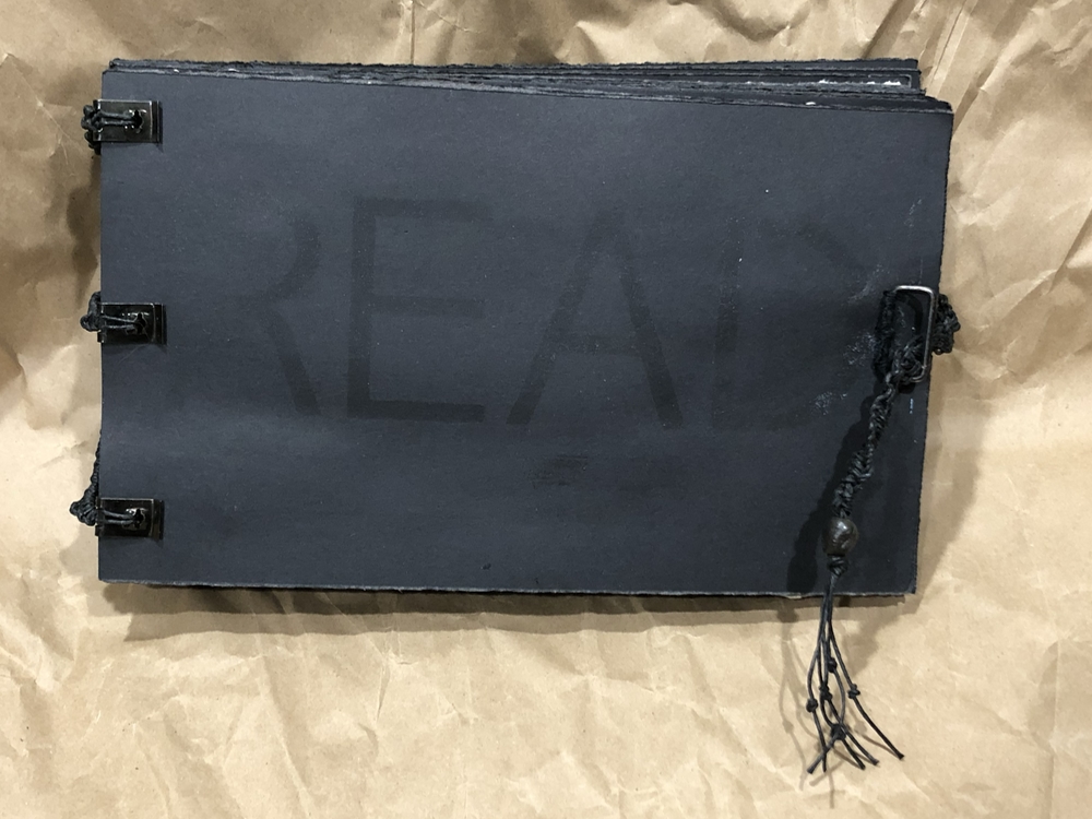
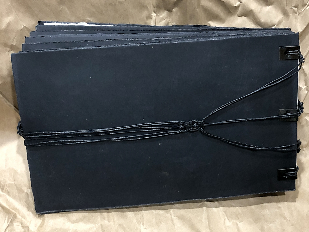
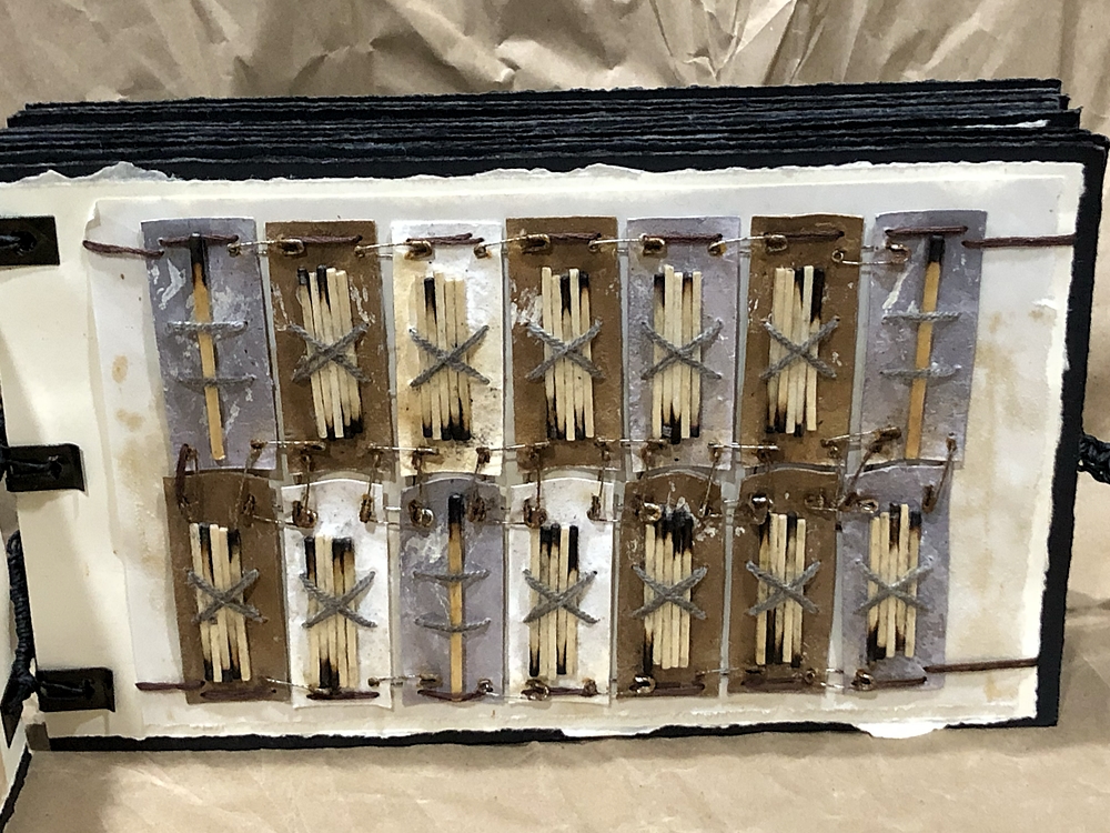
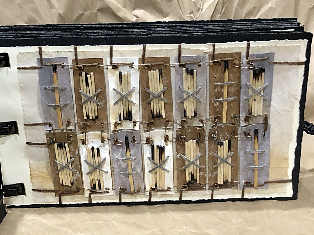
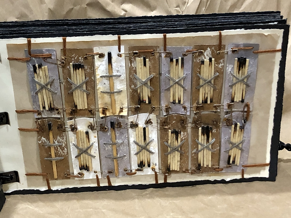
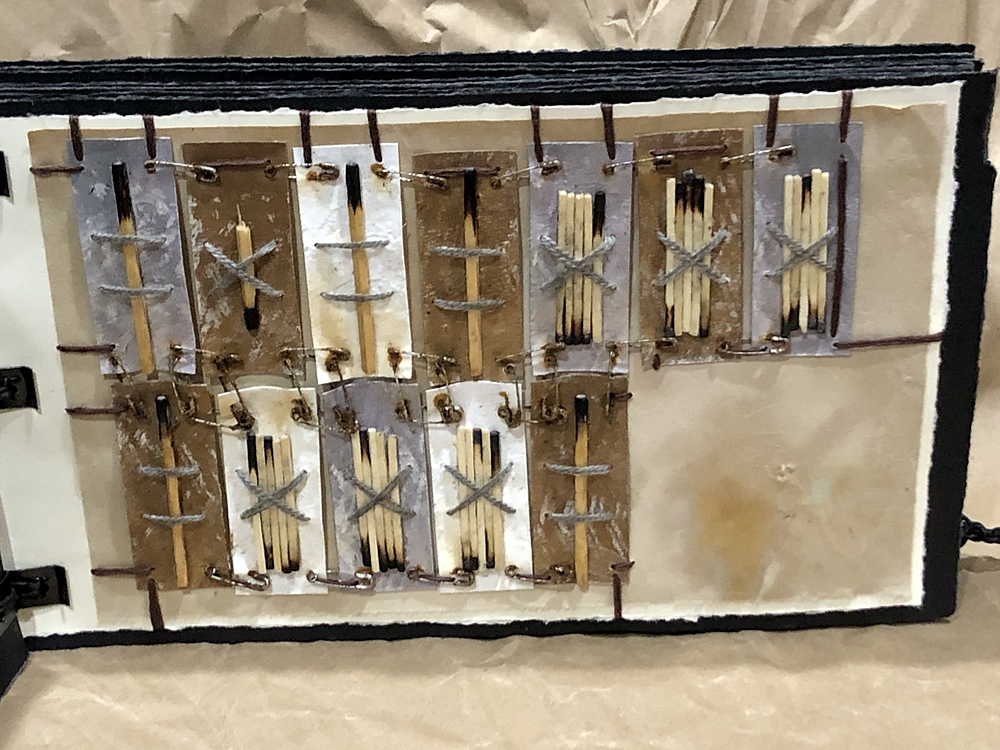
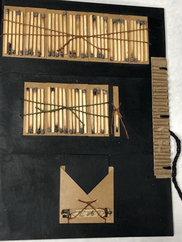
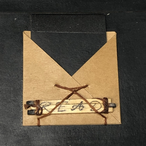
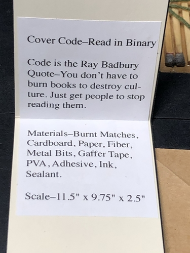
Read–Ray Bradbury
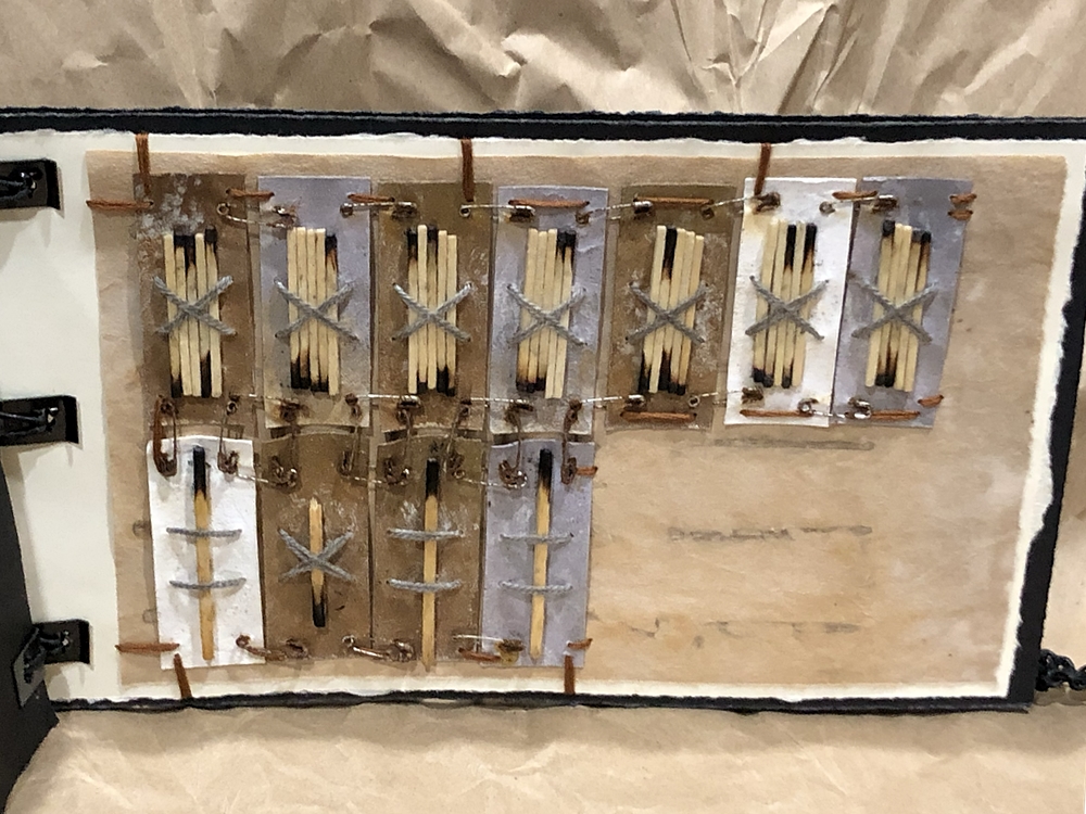
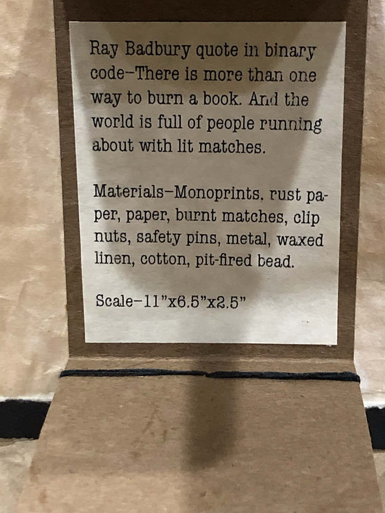
The Ray Bradbury quote used in the piece is–You don’t have to burn books to destroy culture. Just get people to stop reading them.
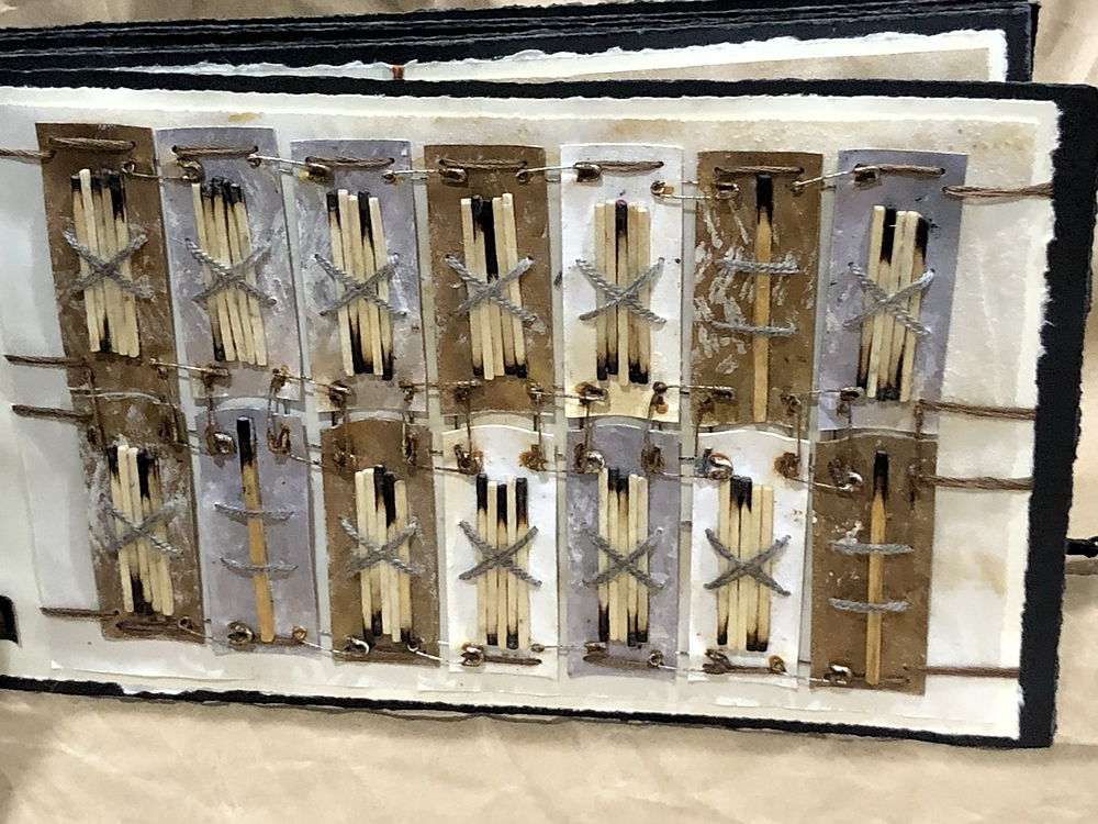
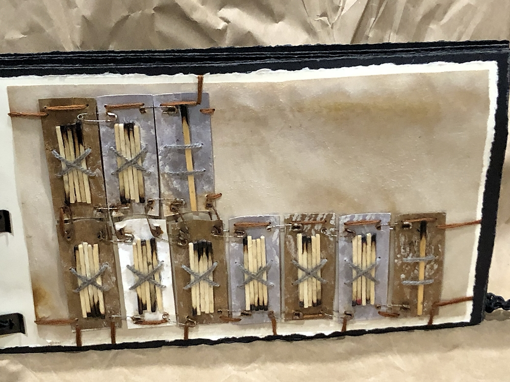
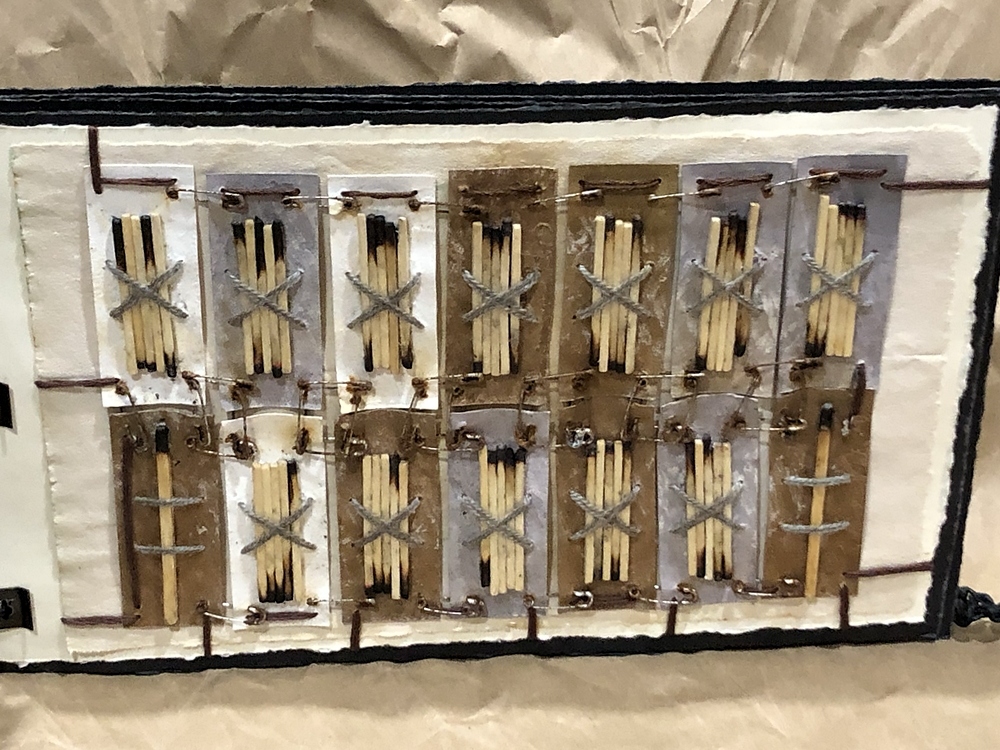
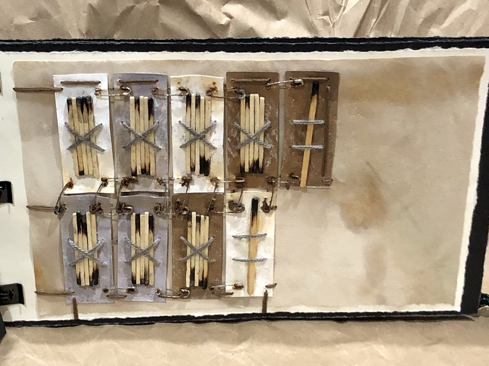
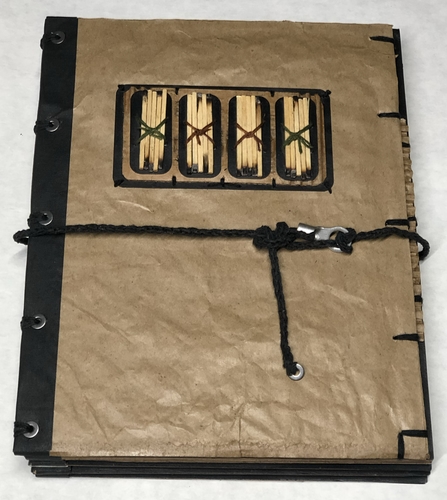
This is the first piece that I used a binary code. Since I planned to use burnt matches for the code, binary was a good fit. The book was completed in September.
Binary Code–Read
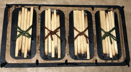
You Don’t Have To
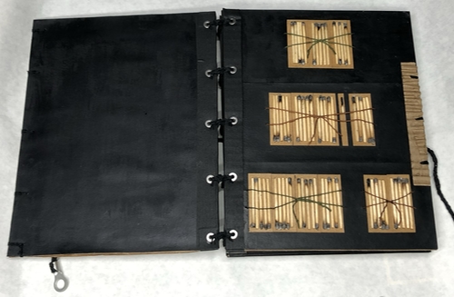
You
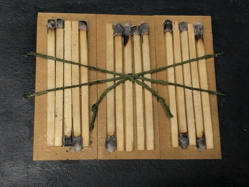
Burn Books To
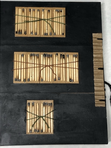
Destroy Culture. Just
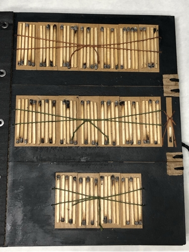
Get People To Stop
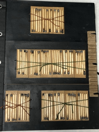
Reading Them.
Notes on Work
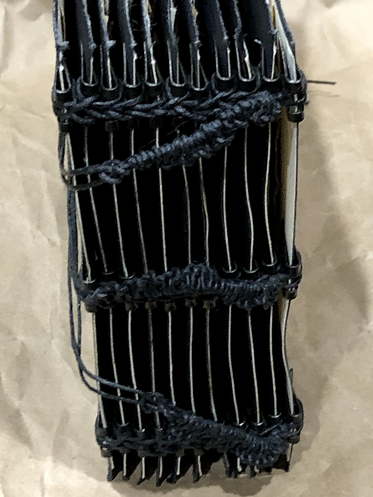
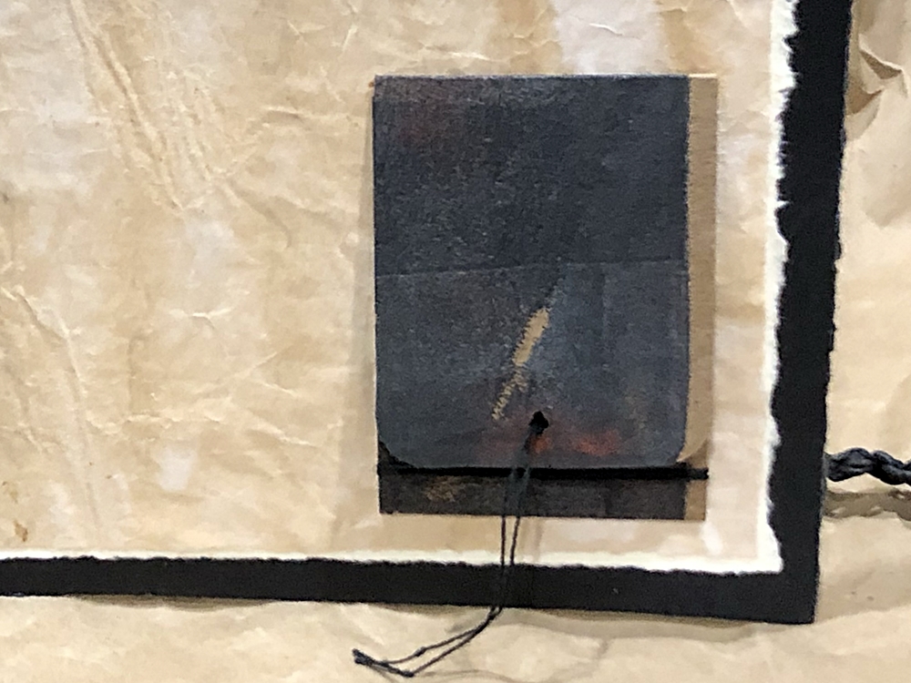
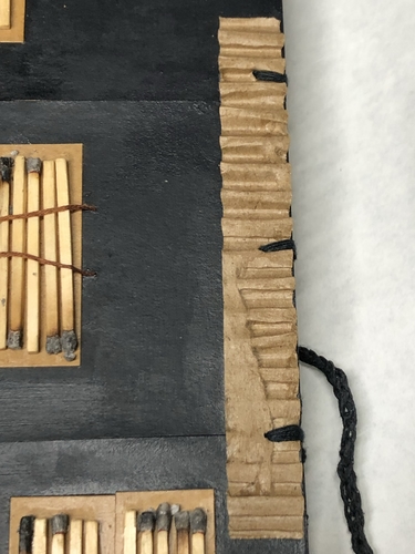
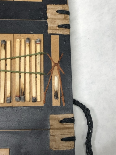
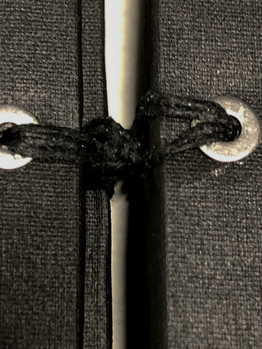
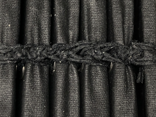
There is a square knot between each page.
Materials–Burnt Matches, Cardboard, Packing Envelope, Paper, Fiber, Metal bits, Gaffer Tape, PVA, Adhesive, Ink, Sealant.
Scale_11.5″ x 9.75″ x 2.5″